Long Term Hold Of Broad Market ETFs
From our perspective, if one does not wish to actively trade securities and holds to the premise that it is very difficult to consistently beat the market over the long term, it becomes prudent to find broad investment vehicles that one can place money into without having to be concerned with when the money placed in such a vehicle. Ideally, the vehicle has shown it can provide returns over the long term that, not only are positive on an annualized basis, but also beat inflation on an annualized basis ensuring the purchasing power of the invested money does not degrade.
This analysis started by using the ETF Screener at barchart.com (https://www.barchart.com/ca/etfs-funds/etfs-screener) to select their full data set. At the time (as of May 15, 2025), their were 1,504 listed ETFs in the unfiltered screener results. Historical, dividend adjusted, price data was then download for each symbol from the unfiltered list. The data was then sorted based on the number of dividend adjusted end of day prices available in the data set. Only ETFs with 2,500 or more dividend adjusted end of day prices were selected which narrowed the list of ETFs to consider to 210.
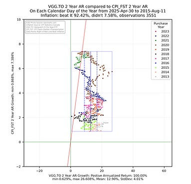
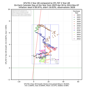
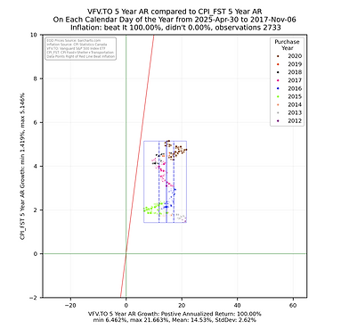
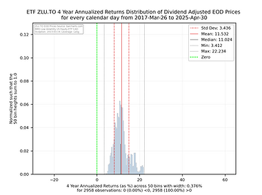
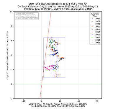
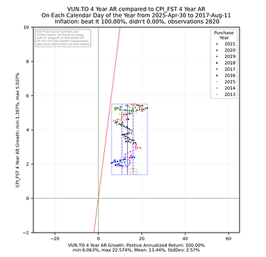
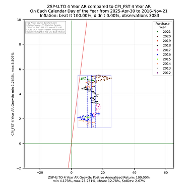
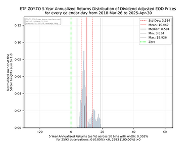
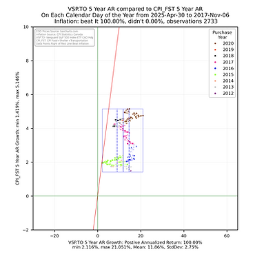
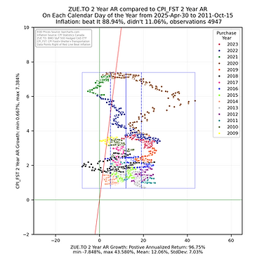
The analysis focused on generating histogram and scatter plot data to allow for a comparison of the 2, 3, 4, & 5 year annualized returns from the ETF compared to the 2, 3, 4, & 5 year annualized returns of the CPI index (https://www150.statcan.gc.ca/t1/tbl1/en/tv.action?pid=1810000601) for the sum of the growth in the Food, Shelter and Transportation (FST) subgroup values - this is a measure of inflation that focuses on the things most people _have_ to purchase. These returns were calculated by ensuring each calendar day of the considered subset had an end of day value (if one did not, the previous value was copied into that day). The 2, 3, 4, & 5 year annualized returns were calculated for each calendar day going back in time from April 30, 2025 to the respective number years after the ETF inception. The histogram and scatter plot illustrations are rendered using the python library from seaborn (https://seaborn.pydata.org/) using the year of the start date (the day an investor might have purchased the ETF) of the annualized return as the grouping value. A box is drawn around all the returns and vertical lines are drawn inside the box showing the statistical mean and first standard deviation for the ETF. A red line is drawn as reference showing those returns to the right are greater than the respective annualized returns of the CPI FST subgroup sum. As CPI values are provided once per month, the value was taken to be the last day of the month with a straight line step between the that and the previous month end to give each calendar day and end of day value.
The ETF scatterplot data was then sorted based on the percentage of ETF 5 year annualized returns that beat the CPI FST (inflation) and how far the box was shifted to the right on the scatterplot - the further right the better. This resulted in 23 ETFs that had their 5 year annualized returns contained in a box fully to the right of the CPI FST reference line. This sort brought in QQU.TO, Betapro Nasdaq 100 2X Daily Bull ETF, which is significantly more volatile than the rest of the cohort and we have left it in this group to show what a more volatile return set of results looks like (it is also a long running ETF so has a large data set). The returns bounding box was shifted nicely to the right on the 5 year annualized returns scatter plot but those annualized returns have huge swings showing a simple sorting does require further review.
Additionally, you will note that with exception of XWD.TO, XST.TO, HAZ.TO, and VXC.TO, they ETF cohort all provide returns based on the US stock market. VXC.TO and XWD.TO are also heavily weighted in US stocks.
These sorted results are presented below.
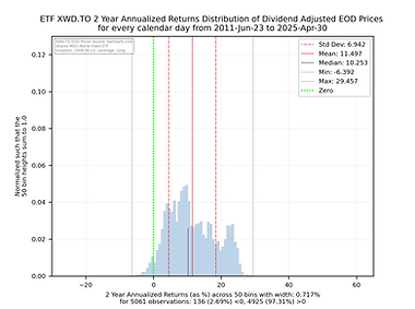
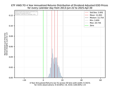
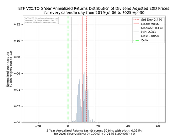
Some things to consider when interpreting the histogram charts below.
-
The green vertical line shows you where an annualized return of 0 falls. Anything to the left will be a negative return. Anything to the right will be positive annualized return.
-
The y axis has been normalized so that the sum of the 50 histogram bin bars sums to 1.0 allowing one to compare and contrast the charts easily as their y and x axes are consistent in size and scale.
-
The shorter black vertical line is the median so you can see how close the median is to the mean.
-
The red solid line is the mean of the distribution and the dashed red lines would be the size of the 1st Standard Deviation if the distribution was considered statistically normal.
-
While some of these charts appear to be normal in shape, many are not so be carefully with relying too heavily on the statistics associated with the distribution.
-
The light grey vertical lines show the absolute min and max of the annualized returns of the distribution for the full set of observations.
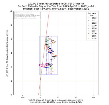
Some things to consider when interpreting the scatterplots above.
-
Each point represents the annualized return ending on the calendar day for the noted ETF being compared with the CPI growth for Food, Shelter and Transportation for the same calendar day.
-
The chart is square to ensure the aspect ratio between the vertical and horizontal axis remain equal to help with visualization.
-
The smaller the rectangle the less volatility in the returns.
-
The bounding box shows the range the the noted ETF annualized returns and annualized CPI growth fall between.
-
The red sloped line divides the data into points on the left falling short of inflation growth and data falling on the right beating CPI growth in the sum of the CPI Food, Shelter and Transportation sub groups.
-
The key take away is that the more points the fall to the right of the red sloped line the better the ETF has been at providing an annualized return that beats the annualized growth the CPI metric. The money invested did not lose purchasing power.
-
These views help to quickly show that the annualized returns for some ETFs are significantly better and providing returns that reduce the risk of loss of purchasing power.